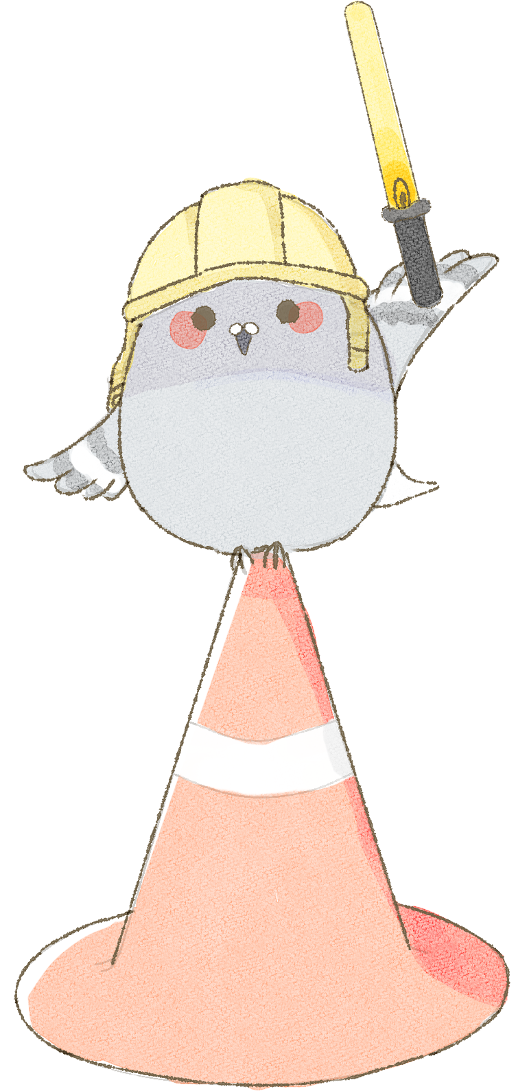
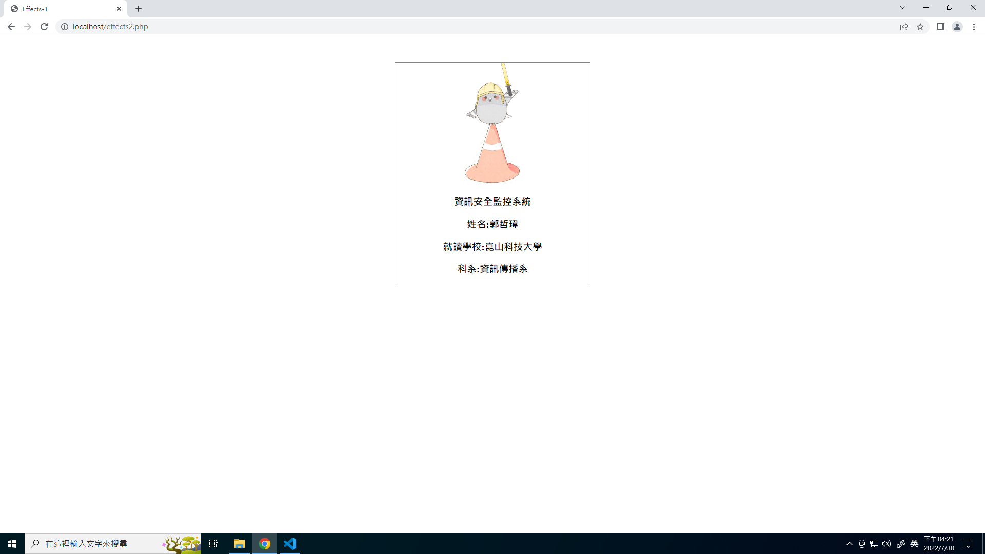
資訊安全監控系統
姓名:郭哲瑋
學校:崑山科技大學
科系:資訊傳播系
姓名:郭哲瑋
學校:崑山科技大學
科系:資訊傳播系
將需要用到的圖片、內容用html語法顯示在網頁
<div class="ant">
	<img src="animate/animate.png" class="animg" />
	<div class="cnt"></div>
	<div class="txt">
		  <h3>資訊安全監控系統</h3>
		<h3>姓名:郭哲瑋</h3>
		<h3>學校:崑山科技大學</h3>
		<h3>科系:資訊傳播系</h3>
	</div>
</div>
藍色字依照自己的設定去寫。
類似像這樣:
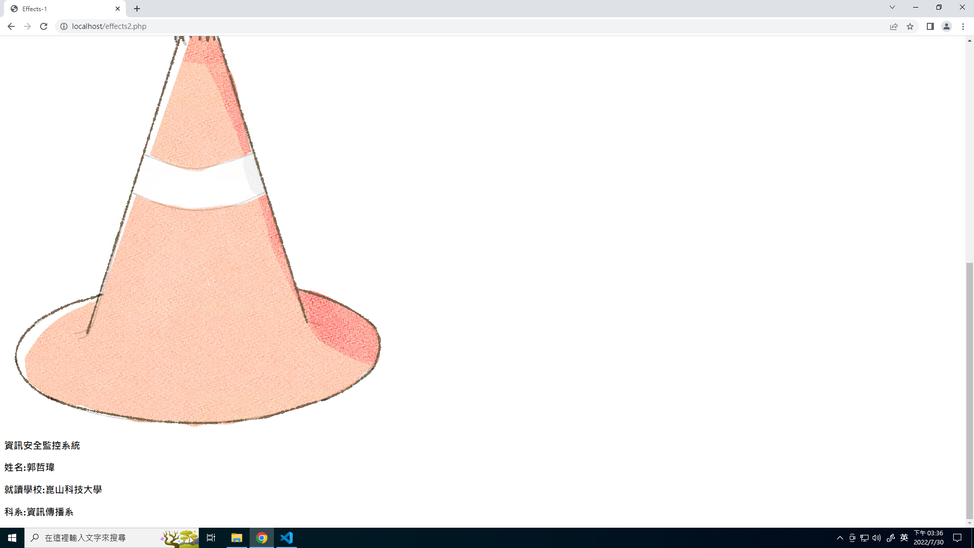
會發現圖片超大張,因位現在是圖片原本的尺寸,所以很大張。
.ant{
  width:20%;
  border:1px solid gray;
}
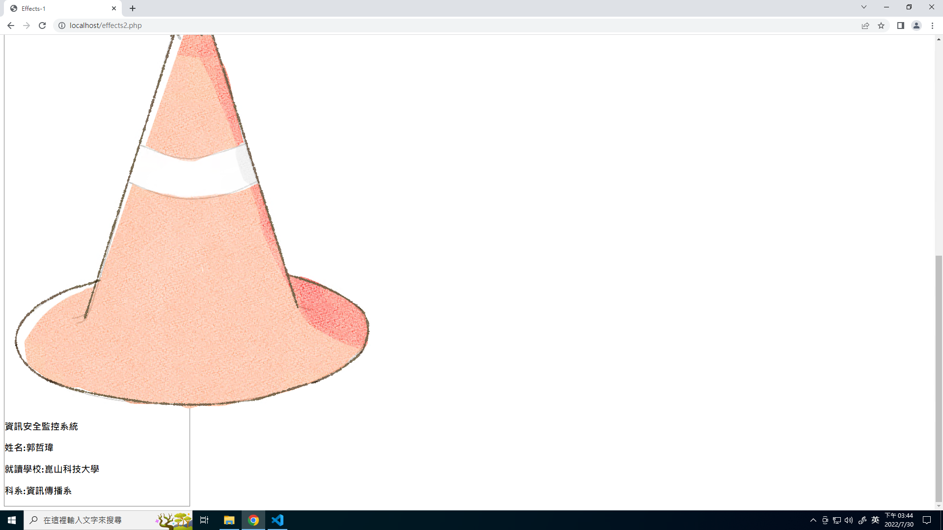
左邊會出現一個框,像這樣:
.animg{
	width:30%;
}
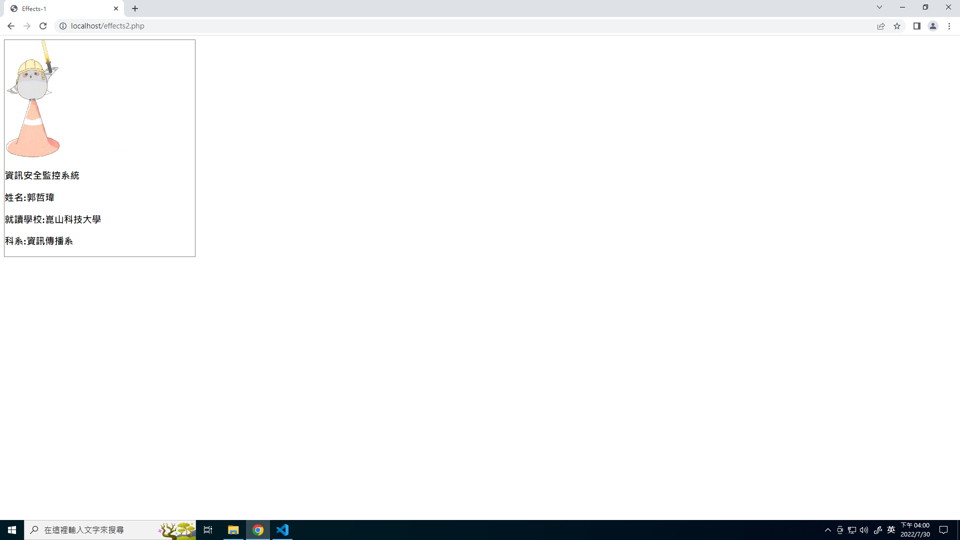
這樣圖片就會依照外層div寬度的30%做縮放
用position的relative和absolute來設定物件的重疊。
.ant{
      width:20%;
      border:1px solid gray;

	****新增下面這幾行****
      text-align:center;
      position:relative;
      margin-left:auto;
      margin-right:auto;
      margin-top:50px;
   }
.cnt{
      position:absolute;
      top:0px;
      height:100%;
      width:100%;
      background-color:black;
      opacity:0.5;
      border:2px solid blue; (完成後會拿掉)
   }
div(txt):
.txt{
      position:absolute;
      top:0px;
      width:100%;
      color:white;
      border:2px solid green; (完成後會拿掉)
   }
完成後會像這樣:
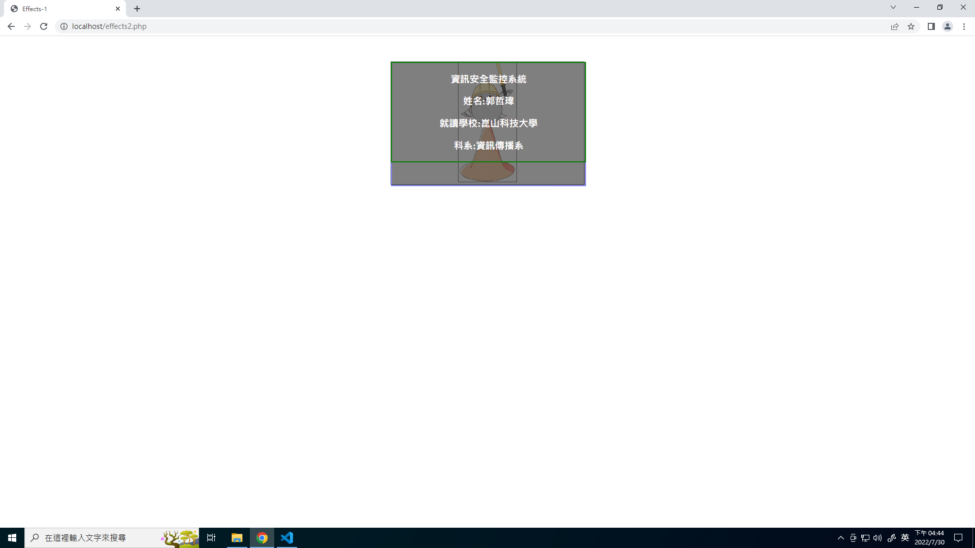
會發現現在的樣子就是當滑鼠hover以後會出現的效果,再來就是設定動畫讓他hover以後會有轉場的效果。
當滑鼠滑入時最外層的div(ant)時會顯示效果。滑鼠的部分就是用 hover,滑鼠滑入後的效果就用到 animation。物件放大和縮小的部分要用到 transform的scale。
transform: scale(X,Y);
X 與 Y 是『倍數』,1 代表不變,小於 1 則是縮小,大於 1 則是放大!
@keyframes imgeft {
     from{transform:scale(1,1);}
     to  {transform:scale(0.75,0.75);}
  }
 .ant:hover .animg{
      animation-name:imgeft;
      animation-duration:0.5s;
      animation-iteration-count:1;
      animation-fill-mode:forwards;
   }
可以看到最下層那張圖片,當滑鼠滑入後會縮小。
黑色背景因為一開始是不會出現的,所以一開始要先讓他不會出現,要如何讓他不會出現呢??,就直接將scale設定成0讓區塊縮到最小就可以了。
.cnt{
      position:absolute;
      top:0px;
      height:100%;
      width:100%;
      background-color:black;
      opacity:0.5;
      border:2px solid blue;

	****新增這一行****
      transform:scale(0,0);
   }
 @keyframes cnteft{
      from{transform:scale(0,0);}
      to  {transform:scale(1,1);}
   }
.ant:hover .cnt{
      animation-name:cnteft;
      animation-duration:0.5s;
      animation-iteration-count:1;
      animation-fill-mode:forwards;
   }
可以看到一開始沒有任何黑色區塊,當滑鼠滑入後黑色背景會有展開的效果。
文字的部分也是要用展開的效果,所以要讓div(txt)的區塊一開始不要出現,那一樣是用transform的scale。
 .txt{
      position:absolute;
      top:0px;
      width:100%;
      color:white;
      border:2px solid green;

	****新增這一行****
      transform:scale(0,0);
   }
@keyframes txtef{
   from{transform:scale(0,0);}
   to  {transform:scale(1,1);}
}
.ant:hover .txt{
     animation-name:txtef;
     animation-duration:0.5s;
     animation-iteration-count:1;
     animation-fill-mode:forwards;
  }
可以看到一開始沒有任何黑色區塊,當滑鼠滑入後黑色背景會有展開的效果。
將所有的外框線(border)全部拿掉以後,就完成了。